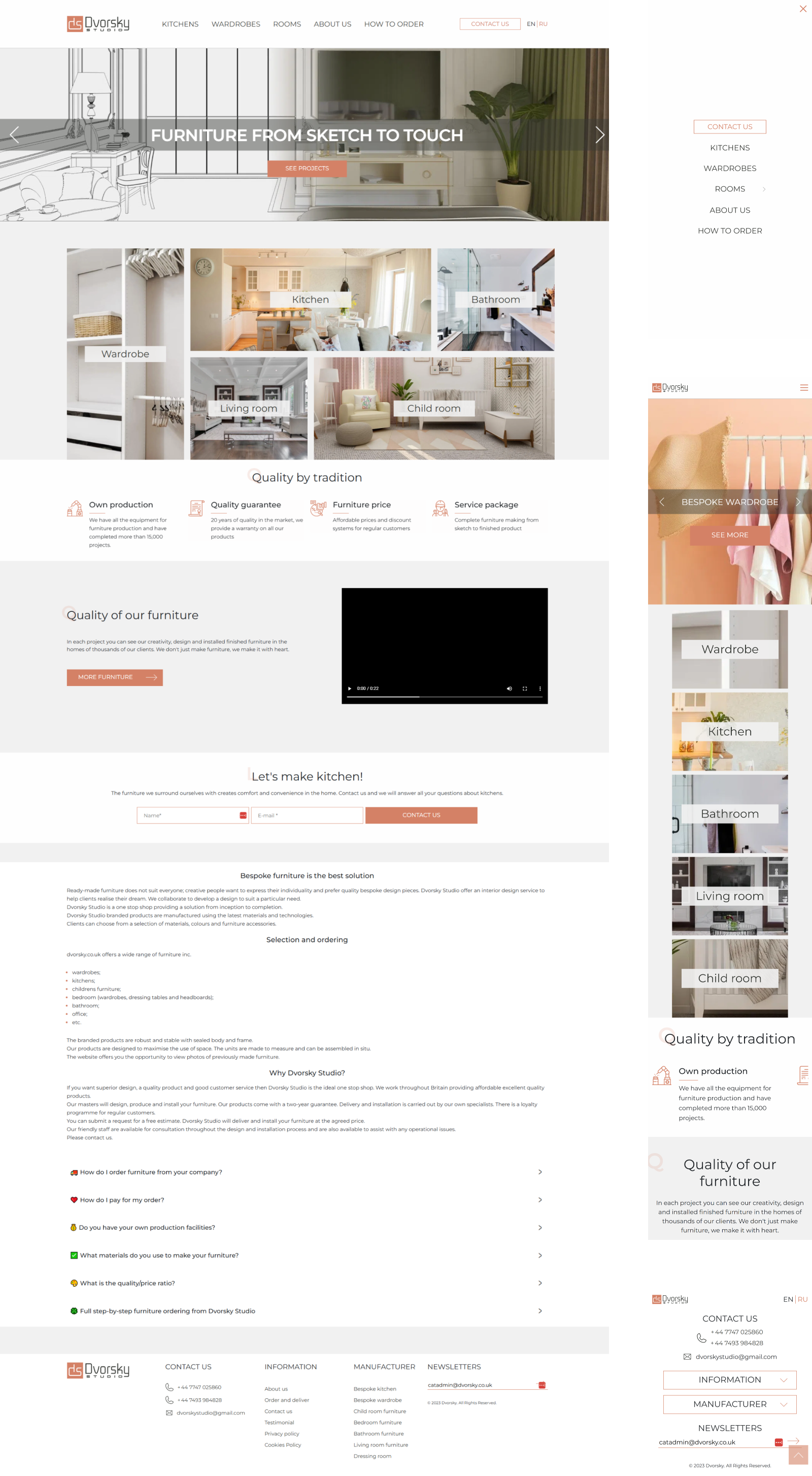
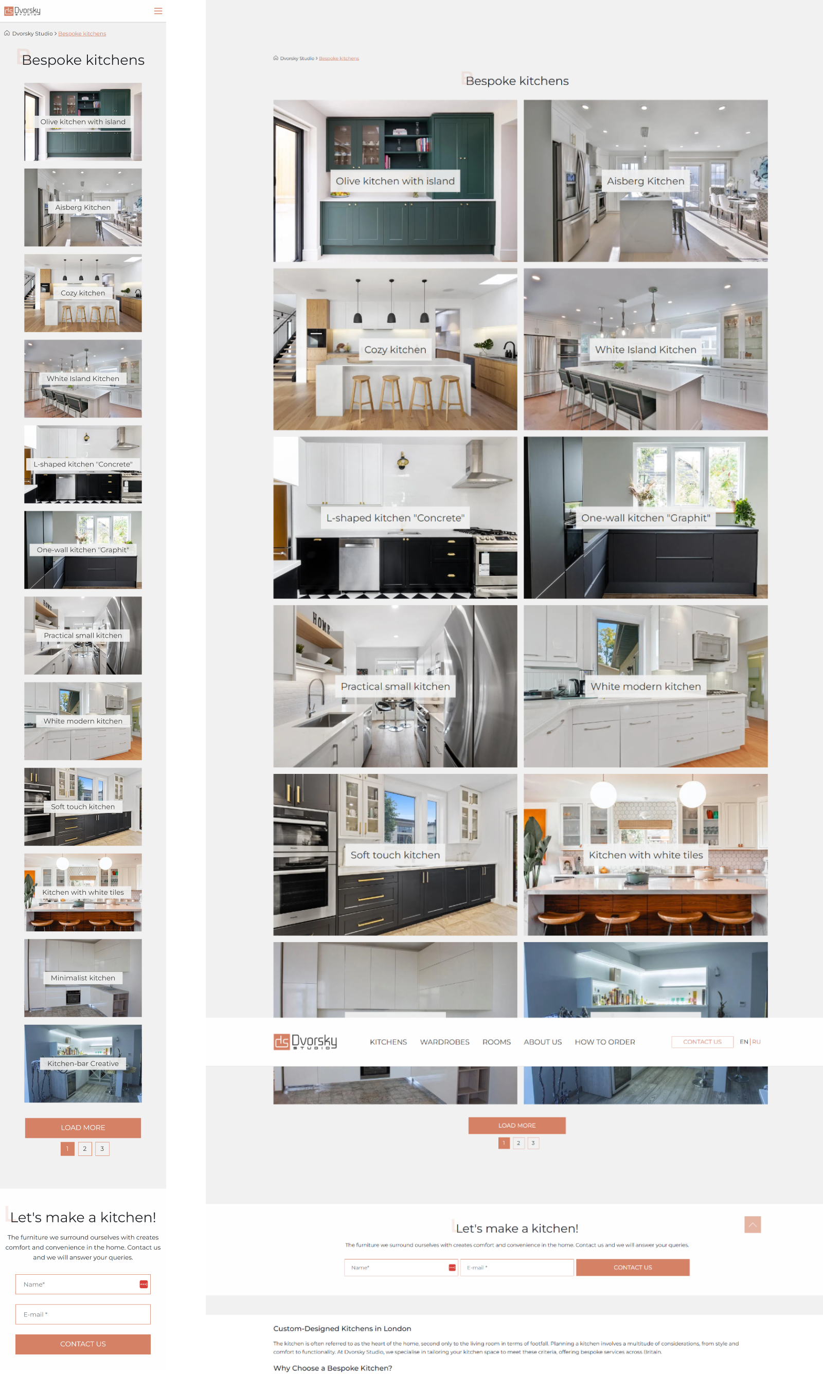
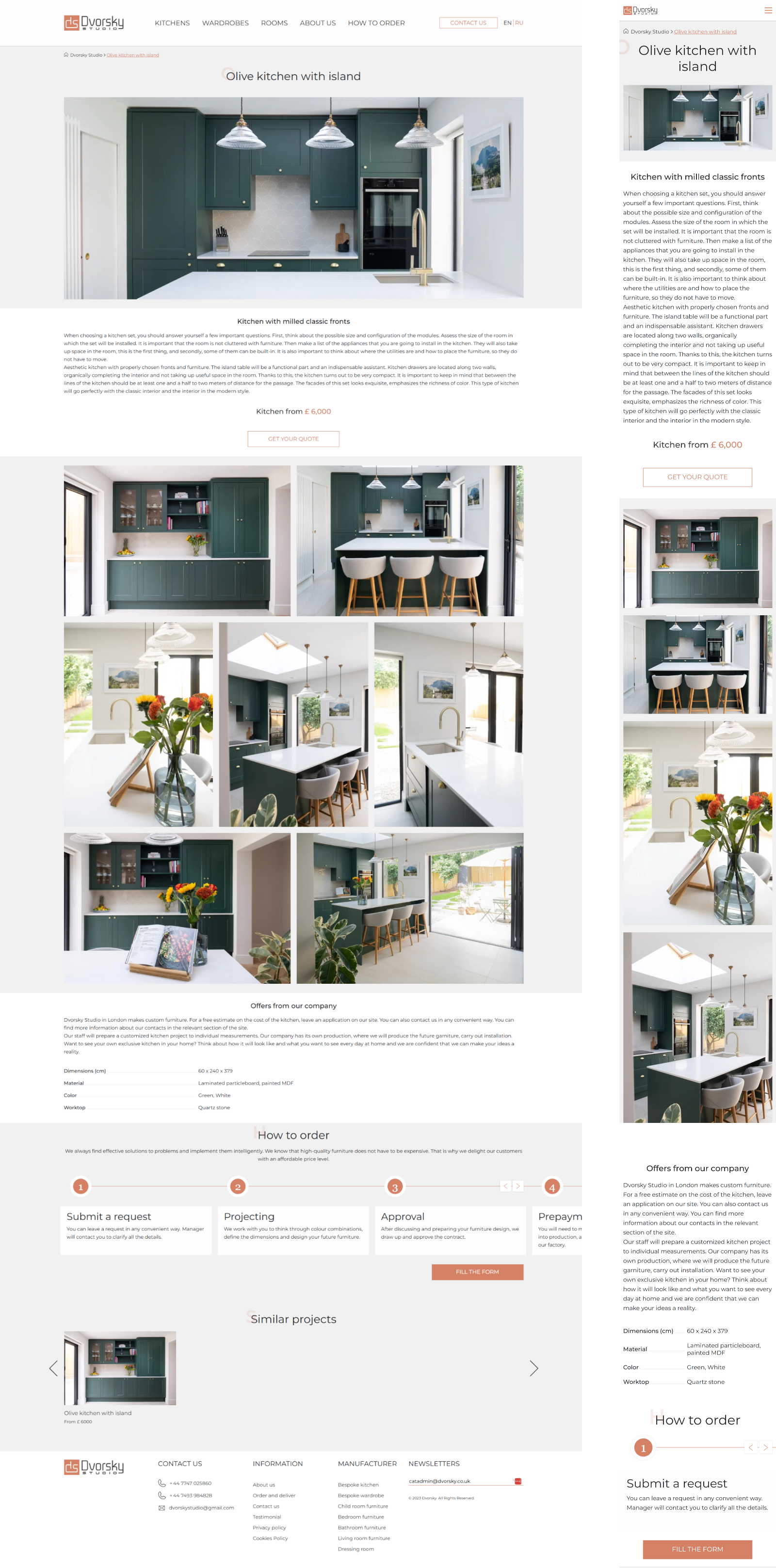
Dvorsky Studio is a manufacturer of exclusive furniture with over 17 years of experience in the market. The company is characterized by a full production cycle: from creating an individual design to the final installation of furniture in the client's home. Over the years, the studio has implemented thousands of projects of varying complexity - from complex solutions for furnishing entire rooms to creating individual interior items.
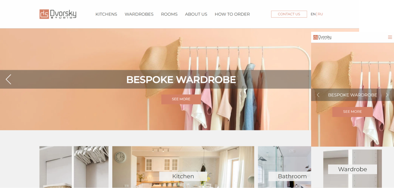
In 2022, Dvorsky Studio entered the British market, offering its furniture creation services to private and corporate clients in the UK. The assortment includes kitchen sets, wardrobe systems, as well as individual pieces of furniture for business - from the hallway to the home office. The production facility located in Ukraine is equipped with modern equipment and allows us to implement projects of any complexity, while maintaining the optimal ratio of European quality and competitive price.
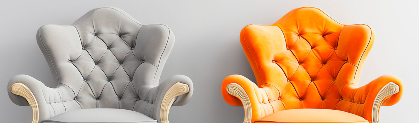
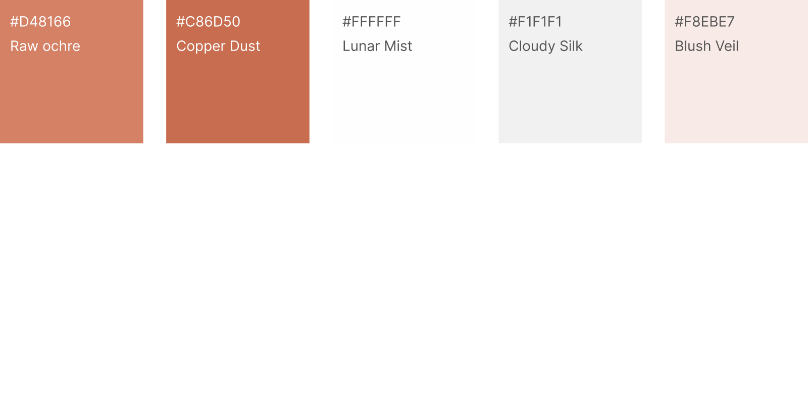
Dvorsky Studio's design is based on an elegant and minimalistic color palette, where the basis is a noble combination of warm shades: from rich ochre (Raw ochre) to delicate copper (Copper Dust). The palette is complemented by different shades of white, which creates a feeling of lightness. This color scheme emphasizes the premium nature of the brand and at the same time creates a warm, inviting atmosphere.
Montserrat was chosen as the main font in three versions. This modern geometric sans-serif font provides excellent readability and gives the site a modern look. The use of different strokes allows you to create a clear visual hierarchy of content, where Bold emphasizes important elements, and Regular and Italic provide a comfortable perception of the main text.


 Alberta")